

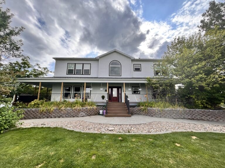
Top Exterior Paint Colors for 2025
Most homeowners start the exterior color conversation the same way: with a photo. A house they saw on Pinterest, a color they liked on a neighbor’s place, a shade that looked great in a magazine. The problem is that a color rarely translates the way people expect once it’s actually on their own house — different roofline, different light, different sized walls, different surroundings entirely.
Picking a color that actually works long-term comes down to a handful of things that have nothing to do with what’s trending this year. Here’s how to actually get it right.
Start With What You Can't Change
Before you look at a single paint chip, look at everything on the house that isn’t getting painted — because those elements decide what will and won’t work.
Roofline. Your roof color sets an undertone whether you plan around it or not. A warm-toned roof (brown, tan, red-brown shingles) generally pairs best with warm body colors. A cooler gray or black roof gives you more flexibility to go cool, neutral, or even bold without clashing.
Stone, brick, or masonry. Any existing stone accents, brick, or foundation work are permanent, and they’re often the hardest element to plan around because they carry their own undertones — some warm, some cool, sometimes both in the same piece of stone. Pull the dominant tone from these materials and let it guide your neutral choices.
Landscaping and setting. A home surrounded by mature trees reads differently than one on an open lot. Deep greens and earth tones tend to blend naturally into wooded surroundings, while lighter neutrals and higher-contrast combinations tend to stand out more on open or urban lots. Neither is right or wrong — it depends on whether you want the house to blend into its setting or stand apart from it.
Understand How Light Changes a Color
This is the step people skip most often, and it’s the one that causes the most repainting regret.
Direct sun washes out light colors and can make pure whites look stark or blown-out, especially at higher elevations or in regions with strong, consistent sun exposure. A white that looks crisp and clean on a shaded sample board can look flat and glaring on a south-facing wall in full sun.
Shade does the opposite — it can make colors read darker and cooler than they actually are. A greige that looks warm and balanced on a sunny wall might read gray and cold on the north side of the same house.
The fix is simple but often skipped: paint a large sample, not a paint chip, on at least two different walls that get different light throughout the day, and look at it in the morning, midday, and evening before buying gallons. A color that only gets tested on one wall in one lighting condition is a color you’re choosing partially blind.
Match the Color to the Architecture
A color that looks great on a modern build can look out of place on a traditional farmhouse, and vice versa — architectural style narrows the field more than most people expect.
Farmhouse and traditional homes tend to hold up best with warm whites, soft neutrals, or classic combinations like white body with black or navy trim.
Mountain-style and cabin builds generally lean into the surrounding landscape — deep greens, warm browns, and earthy neutrals that feel grounded rather than stark.
Modern and contemporary builds are where charcoal, soft black, and higher-contrast combinations tend to work best, since the cleaner architectural lines support a bolder color choice without looking busy.
None of these are hard rules, but they’re a useful starting filter before you fall in love with a color that fights your home’s actual style.
Think About Long-Term Durability, Not Just the First Impression
The color on the sample board and the color five years from now aren’t always the same thing, and this has more to do with paint quality and climate than most homeowners realize.
Darker colors absorb more heat and UV, and tend to show fading and chalking sooner than lighter or mid-tone colors — this matters more in regions with intense sun exposure or significant temperature swings between seasons. That doesn’t mean avoid dark colors; it means a quality paint system and proper application matter even more if you’re going dark.
Climate cycling — freeze-thaw, humidity, heavy snow load — stresses paint at trim joints and high-exposure walls first. A well-applied, correctly primed paint job resists cracking and peeling far longer than a rushed application, regardless of which color you chose.
Test the Neighborhood Context (Without Copying It)
You don’t need to match the homes around you, but it’s worth a look before committing. A color that works with the general tone of the surrounding area — without being identical to it — tends to read as intentional rather than jarring. This is less about following convention and more about making sure your home doesn’t accidentally clash with everything around it.
When You're Ready, Get It Applied Right
A great color choice still depends entirely on the paint job underneath it. Proper surface prep, the right primer, and a quality paint system are what determine whether that color still looks good in five years — or starts peeling at the trim in year two. If you want to see how we approach that process, our exterior painting services page walks through what goes into a paint job built to last, not just to look good on install day.
Frequently Asked Questions
How do I choose an exterior paint color for my house?
Start with the elements that won’t change — roofline, stone, brick, and landscaping — since these set the undertone your paint color needs to work with. From there, factor in your home’s architectural style and how much direct sun different walls receive before narrowing down to a final color.
Do exterior paint colors need to match the neighborhood?
No, but it helps to consider the general tone of the surrounding area. You’re not obligated to match your neighbors, but a color that complements the setting — trees, terrain, nearby homes — tends to look more intentional than one that clashes with it.
Why does my paint sample look different on the house than on the chip?
Lighting is the main reason. Direct sun washes out light colors and can make whites look stark, while shaded walls make the same color read darker and cooler. Always test a large sample on multiple walls in different light before choosing a final color.
Do darker exterior colors fade faster?
Generally, yes — darker colors absorb more heat and UV exposure, which can accelerate fading and chalking compared to lighter or mid-tone colors. A quality paint system and proper application can significantly offset this, so it’s not a reason to avoid a dark color you love.
Ready to talk through color options for your own home? Contact Black Mountain Painting for a free consultation, or browse recent projects to see real examples before you decide.