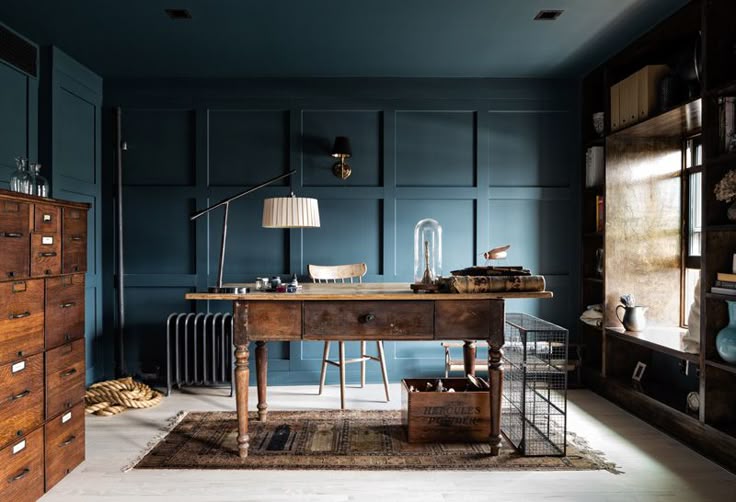
The Rise of Deep, Moody Colors
In 2025, deep moody colors are moving to the forefront of professional interior design. For many years, white and pale gray dominated residential and commercial spaces. Today, homeowners and designers are turning toward richer, more saturated palettes that create depth, warmth, and sophistication. Shades such as charcoal, forest green, navy, and black are now being used for complete rooms, cabinetry, ceilings, and even exteriors. When applied correctly, these colors elevate the architectural features of a property and create a timeless aesthetic.
Why Deep Moody Colors Are Gaining Popularity
1. A Move Toward Comfort and Warmth
After years of light, minimalist interiors, more homeowners want rooms that feel cozy and inviting. Deep colors make a space feel grounded, intimate, and timeless.
2. Growing Confidence in Bold Choices
With more people seeing professional designs online, they are more willing to try rich, dramatic colors in their own homes.
3. Bringing the Outdoors Inside
Shades like dark green, navy, and brown reflect the colors of nature. They create a calming, natural atmosphere indoors.
Top Moody Colors for 2025
Deep Navy
A refined choice for dining rooms, kitchens, and offices. Looks great with gold hardware, bright white trim, leather, and wood accents.
Charcoal Gray
Dramatic but softer than black. Perfect for bedrooms, bathrooms, and accent walls. Pairs beautifully with warm wood, crisp white, and brushed metal.
Forest Green
Earthy and classic. Works well with brass, beige, and natural fabrics. Great for living rooms, offices, and kitchen cabinets.
Eggplant Purple
Rich and elegant. Best for dining rooms, libraries, or statement walls. Complements gold, soft gray, and plush or textured fabrics.
Black
Bold yet versatile. Ideal for powder rooms, modern kitchens, and even exteriors. Balance with natural wood, warm neutrals, and soft lighting.
How to Use Moody Colors Successfully
Plan Your Lighting
Dark colors absorb light. Use a mix of overhead, task, and accent lighting. Warm bulbs make the space feel more welcoming.
Start Small
Try deep tones on a feature wall or cabinetry before committing to an entire room.
Balance with Light Colors
Pair moody shades with lighter neutrals to keep the room from feeling heavy.
Add Texture
Layer fabrics, wood, and metal finishes for more depth and visual interest.
Best Places to Use Moody Colors
Dining Rooms – For a refined, intimate setting
Bedrooms – To encourage rest and comfort
Home Offices – For focus and a polished look
Powder Rooms – For a bold, contained statement
Why These Colors Last
Moody colors have been used in beautiful homes for centuries. Many historic properties feature richly painted rooms that still feel timeless today. With quality materials and expert craftsmanship, these shades stay stylish for decades.
Work with a Professional Painter
Choosing and applying deep colors takes skill. At Black Mountain Painting, our interior painting services ensure your colors look flawless and last for years.
We also offer exterior painting for homeowners who want to make a strong statement outside.
Our color consultation service will help you pick the perfect shades for your home’s style and lighting.
Schedule your free consultation today and bring your home to life with a rich, timeless palette.